Wedge
The wedge mark type represents a solid arc, akin to a bar in polar coordinates, that can be filled (via fillStyle) and stroked (via strokeStyle). Wedges are used for some popular visualization types, including pie charts and donut charts.
See also: pv.Wedge API reference
Examples: Pie & Donut Charts, Burtin’s Antibiotics, PolarClock
Placement
A wedge’s placement is specified through some combination of properties:
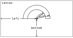
- top - the distance from the top edge of the parent panel to the wedge center.
- left - the distance from the left edge of the parent panel to the wedge center.
- bottom - the distance from the bottom edge of the parent panel to the wedge center.
- right - the distance from the right edge of the parent panel to the wedge center.
- startAngle - the start angle of the wedge in radians.
- endAngle - the end angle of the wedge in radians.
- angle - the angle subtended by the wedge in radians.
- innerRadius - the inner radius of the wedge.
- outerRadius - the outer radius of the wedge.
Should the radius be used to encode data, the area of the wedge is proportional to the square of the radius. The inner radius defaults to 0, suitable for pie charts; a positive value can be used for donut charts.
Note that first four properties together over-specify the center of the wedge. In practice, only two (orthogonal) properties should be specified. This section looks at some examples.
Using left and bottom with angle
In most cases, the left and bottom will be constant, since the instantiated wedges will share the same center point; the data is instead visually encoded using angle. For example, a simple pie chart:
new pv.Panel()
    .width(150)
    .height(150)
  .add(pv.Wedge)
    .data(pv.normalize([1, 1.2, 1.7, 1.5, .7]))
    .left(75)
    .bottom(75)
    .outerRadius(70)
    .angle(function(d) d * 2 * Math.PI)
  .root.render();
|
Observe that the angle property is specified, rather than startAngle and endAngle. The default implementation of startAngle uses the value of the previous wedge's end angle. This way, by specifying just the angle, the wedges neatly stack together to produce a whole. It is still possible to provide custom implementations for the start and end angle, but this is rarely needed.
Note the preprocessing step to normalize the data array. This produces a rescaled copy of the original data array, such that the sum of all values is 1; this simplifies the subsequent calculation of the wedge angle. An alternative is to calculate the sum:
var data = [1, 1.2, 1.7, 1.5, .7], sum = pv.sum(data);

var vis = new pv.Panel()
    .width(150)
    .height(150);

vis.add(pv.Wedge)
    .data(data)
    .left(75)
    .bottom(75)
    .innerRadius(50)
    .outerRadius(70)
    .angle(function(d) d / sum * 2 * Math.PI);

vis.render();
|
But perhaps the best alternative is to use a linear scale.
Using innerRadius and outerRadius
In the previous example, we saw that a donut chart can be produced instead of a pie chart by changing the inner radius. If desired, you can vary the inner and outer radius based on data, though note that the area of a wedge is proportional to the square of its radius:
new pv.Panel()
    .width(150)
    .height(150)
  .add(pv.Wedge)
    .data([1, 1.2, 1.7, 1.5, .7])
    .left(75)
    .bottom(75)
    .outerRadius(function(d) Math.sqrt(d) * 50)
    .angle(2 * Math.PI / 5)
  .root.render();
|
Varying the inner radius can also be used to nest donuts (or pies):
new pv.Panel()
    .width(150)
    .height(150)
  .add(pv.Wedge)
    .data(pv.normalize([1, 1.2, 1.7, 1.5, .7]))
    .left(75)
    .bottom(75)
    .innerRadius(51)
    .outerRadius(70)
    .angle(function(d) d * 2 * Math.PI)
  .add(pv.Wedge)
    .data(pv.normalize([.3, .2, 1, 1.5, .4]))
    .innerRadius(30)
    .outerRadius(49)
  .root.render();
|
The above examples merely demonstrate possible visualiations using wedges; they are not necessarily examples of good visualizations. Care should be taken when using wedges, as studies have shown that angle judgements are generally less accurate than position or length judgements. These inaccuracies can be compounded by bad design, as we will see in the next section.
Using startAngle and endAngle
Specifying startAngle and endAngle allows for wedge-based visualizations that are not traditional pie or donut charts. For example, to produce something akin to a speedometer, we can use a fixed start angle, equispaced inner and outer radius, and a variable end angle:
new pv.Panel()
    .width(150)
    .height(150)
  .add(pv.Wedge)
    .data([1, 1.2, 1.7, 1.5, .7])
    .left(75)
    .bottom(75)
    .startAngle(Math.PI)
    .innerRadius(function() this.index * 10 + 20)
    .outerRadius(function() this.index * 10 + 30)
    .angle(function(d) d * 2)
  .root.render();
|
Of course, it is possible to go overboard with this technique:
var s = 0, vis = new pv.Panel()
    .width(150)
    .height(150);

vis.add(pv.Wedge)
    .data([1, 1.2, 1.7, 1.5, .7])
    .left(75)
    .bottom(75)
    .startAngle(Math.PI)
    .innerRadius(function() this.index * 10 + 20)
    .outerRadius(function() this.index * 10 + 30)
    .startAngle(function() (s += .001) * (this.index + 1))
    .angle(function(d) d * 2);

setInterval(function() vis.render(), 35);
|
Wedges should be used judiciously. Although the examples in this section may be aesthetically pleasing, note in particular that the innermost dark blue wedge is significantly smaller (at 260 square pixels) than the outermost green wedge (470 square pixels). This is grossly misleading, since the associated datum (1.0) is in fact 40% larger (0.7)! The lie factor in this case is 2.7.
Style
Like bars, a wedge’s visual style is specified through three optional attributes
- fillStyle
- strokeStyle
- lineWidth
By default, a fill color is allocated from the category20 color palette for each mark instance. Most instances of a given mark share the same color, such as bars in a bar chart; in contrast, wedges are allocated unique colors by default. The default strokeStyle is null, while the default lineWidth is 1.5 pixels.
These three visual parameters can be specified on a per-instance basis, meaning they too can be used to encode data visually. For example, to make a rainbow:
new pv.Panel()
    .width(150)
    .height(150)
  .add(pv.Wedge)
    .data(["red", "orange", "yellow", "green", "blue", "purple"])
    .left(75)
    .bottom(75)
    .startAngle(-Math.PI)
    .endAngle(0)
    .innerRadius(function() this.index * 5 + 30)
    .outerRadius(function() this.index * 5 + 35)
    .fillStyle(function(d) d)
  .root.render();
|
If strokeStyle is non-null, a path is stroked around the perimeter of the wedge. The thickness of the path is controlled by the lineWidth property. For example, a quick way to separate wedges is to use a white border, at the expense of some accuracy in angle comparison (especially for small wedges):
new pv.Panel()
    .width(150)
    .height(150)
  .add(pv.Wedge)
    .data(pv.normalize([1, 1.2, 1.7, 1.5, .7]))
    .left(75)
    .bottom(75)
    .outerRadius(65)
    .angle(function(d) d * 2 * Math.PI)
    .strokeStyle("white")
    .lineWidth(4)
  .root.render();
|
An alternative, more correct, approach is to offset the left and bottom position, so the wedges are offset from the center. Perhaps this could be incorporated into a future pie layout. Here’s an interactive example:
new pv.Panel()
    .width(150)
    .height(150)
  .add(pv.Wedge)
    .def("o", -1)
    .data(pv.normalize(pv.range(10).map(Math.random)))
    .outerRadius(65)
    .angle(function(d) d * 2 * Math.PI)
    .left(function() 75
        + Math.cos(this.startAngle() + this.angle() / 2)
        * ((this.o() == this.index) ? 10 : 0))
    .bottom(function() 75
        - Math.sin(this.startAngle() + this.angle() / 2)
        * ((this.o() == this.index) ? 10 : 0))
    .event("mouseover", function() this.o(this.index))
  .root.render();
|
See the color documentation for more examples of acceptable values for stroke and fill styles.