Labels
The label mark type represents a textual annotation. Labels are used in almost all visualizations, either to identify axes, grid line values, or annotate specific data points.
See also: pv.Label API reference
Examples: Bar & Column Charts, Stemplots
Placement
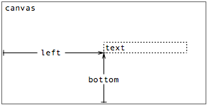
A label’s placement is specified using the standard box model, much like a dot, through a combination of properties:
- top - the distance from the top edge of the parent panel to the text anchor.
- left - the distance from the left edge of the parent panel to the text anchor.
- bottom - the distance from the bottom edge of the parent panel to the text anchor.
- right - the distance from the right edge of the parent panel to the text anchor.
These properties specify the distance between the text anchor of the label and the corresponding edge of the parent panel. Note that these properties together over-specify the position of the anchor. In practice, only two (orthogonal) properties should be specified. This section looks at some examples.
Once the anchor is set, the placement of text is controlled by additional parameters:
- textAlign - horizontal alignment.
- textBaseline - vertical alignment.
- textMargin - margin to offset from the text anchor.
- textAngle - rotation angle, in radians.
The default text alignment is “left”, and the default baseline is “bottom”. The default text margin is 3, measured in pixels. The default text angle is 0, measured in radians.
Using left and bottom
In the simplest incarnation, a label can be instantiated singly to provide an annotation, such as a title. Here the title is centered near the top of the canvas:
var vis = new pv.Panel()
    .width(150)
    .height(150);

vis.add(pv.Bar)
    .data([1, 1.2, 1.7, 1.5, .7, .2])
    .bottom(0)
    .width(19)
    .height(function(d) d * 70)
    .left(function() this.index * 24 + 5);

vis.add(pv.Label)
    .left(75)
    .top(16)
    .textAlign("center")
    .text("Bar Heights Decline");

vis.render();
|
Static labels can be used to provide other annotations, such as captions and legends. Note however that rich-formatting and wrapping features are not exposed in Protovis. If these features are desired, it may be possible to generate the appropriate HTML outside of Protovis, and place it over the visualization.
More commonly, labels are used to annotate data marks, such as bars, axis ticks, and grid lines. Using inheritance, it is easy to derive a label from a bar. For example:
new pv.Panel()
    .width(150)
    .height(150)
  .add(pv.Bar)
    .data([1, 1.2, 1.7, 1.5, .7, .2])
    .bottom(0)
    .width(19)
    .height(function(d) d * 70)
    .left(function() this.index * 24 + 5)
  .add(pv.Label)
  .root.render();
|
Note that the label inherits the bottom and left values from the bar, but otherwise retains the default values. Also note that the default behavior for the text property simply displays the data element associated with the mark instance.
In the same vein, here we use inheritance to add labels to grid lines:
var vis = new pv.Panel()
    .width(150)
    .height(150);

vis.add(pv.Bar)
    .data([1, 1.2, 1.7, 1.5, .7])
    .bottom(10)
    .width(20)
    .height(function(d) d * 70)
    .left(function() this.index * 25 + 24);

vis.add(pv.Rule)
    .data(pv.range(4))
    .bottom(function(d) d / 2 * 70 + 10)
    .left(24)
    .right(6)
    .strokeStyle(function(d) (d > 0) ? "white" : "black")
  .add(pv.Label)
    .textAlign("right")
    .textBaseline("middle")
    .text(function(d) (d / 2).toFixed(1));

vis.render();
|
While the direct inheritance approach may be sufficient for some cases, often we want to further specify the visual parameters of the label. For instance, we might want to display the label in white, centered at the top of the bar. One way to do this is to use property chaining:
var vis = new pv.Panel()
    .width(150)
    .height(150);

var bar = vis.add(pv.Bar)
    .data([1, 1.2, 1.7, 1.5, .7, .2])
    .bottom(0)
    .width(20)
    .height(function(d) d * 80)
    .left(function() this.index * 25);

bar.add(pv.Label)
    .top(function() bar.top())
    .left(function() bar.left() + bar.width() / 2)
    .textAlign("center")
    .textBaseline("top")
    .textStyle("white");

vis.render();
|
While explicit, an obvious downside of the above approach is that it is verbose. This quickly becomes tedious and error-prone when labels are desired for more complex marks, such as the wedges comprising a pie chart:
var data = [1, 1.2, 1.7, 1.5, .7], sum = pv.sum(data);

var vis = new pv.Panel()
    .width(150)
    .height(150);

var wedge = vis.add(pv.Wedge)
    .data(data)
    .left(75)
    .bottom(75)
    .outerRadius(70)
    .angle(function(d) d / sum * 2 * Math.PI);

wedge.add(pv.Label)
  .left(function() 45 * Math.cos(wedge.midAngle()) + 75)
  .bottom(function() -45 * Math.sin(wedge.midAngle()) + 75)
  .textAlign("center")
  .textBaseline("middle");

vis.render();
|
Fortunately, there is a simple alternative that allows the specification of marks in the familiar places: marks can expose anchors. Like most other visual properties, the anchor name is dynamic and can vary based on data using a function rather than a constant. This makes it easy to use a different anchor for some marks. Another option is to vary the text placement relative to the anchor, such as on bars that would be too short to contain the label fully:
new pv.Panel()
    .width(150)
    .height(150)
  .add(pv.Bar)
    .data([1, 1.2, 1.7, 1.5, .7, .1])
    .bottom(0)
    .width(19)
    .height(function(d) d * 70)
    .left(function() this.index * 24 + 5)
  .anchor("top").add(pv.Label)
    .textBaseline(function(d) (d < .2) ? "bottom" : "top")
  .root.render();
|
In the last section on text placement, we look at the angle property, which allows for text rotation. Although this by itself may impede readability, it is still desirable for some visualizations.
Using angle
Here is yet another way to label bars with their associated values, using the bottom anchor and rotating the text so that it reads vertically:
new pv.Panel()
    .width(150)
    .height(150)
  .add(pv.Bar)
    .data([1, 1.2, 1.7, 1.5, .7, .1])
    .bottom(0)
    .width(19)
    .height(function(d) d * 70)
    .left(function() this.index * 24 + 5)
  .anchor("bottom").add(pv.Label)
    .textAlign("left")
    .textBaseline("middle")
    .textAngle(-Math.PI / 2)
  .root.render();
|
Note that when rotated text is used, you will often need to override the textAlign and textBaseline parameters as well. The built-in anchors are designed to work with non-rotated text by default.
Style
A label’s visual style is specified through optional attributes:
- font - CSS2 font.
- textStyle - text color.
By default, the textStyle is black and the font is “10px sans-serif”, consistent with the default behavior for the standard canvas element. Any allowable font specification can be used, but the system is currently designed to use the sans-serif font in pixel sizes.
It is possible to vary the font and text style on a per-instance basis, but this should be used judiciously:
new pv.Panel()
    .width(150)
    .height(150)
  .add(pv.Dot)
    .data([[.1, 1, .4], [.5, 1.2, .3], [.9, 1.7, .1],
           [.4, 1.5, 1], [.3, 1.4, 4], [.7, 2.2, 1]])
    .left(function(d) d[0] * 150)
    .bottom(function(d) d[1] * 50)
    .size(function(d) d[2] * 400)
    .fillStyle("rgba(30, 120, 180, .4)")
  .anchor("center").add(pv.Label)
    .font(function(d) Math.sqrt(d[2]) * 20 + "px sans-serif")
    .text(function(d) d[2])
  .root.render();
|
See the color documentation for more examples of acceptable values for text styles.